From Peter Lang:
Here’s a first cut at describing charts I think are needed.
For each generator unit (eventually covering a full year)
- Power v time
- Capacity factor v time (I’d suggest to have both lines on on the same chart with power on main Y axis and capacity factor on secondary Y axis).
- Length of time not generating v date, AND number of starts v date (both lines on same chart)
Frequency histogram and cumulative frequency plot (eventually for the full year):
- Proportion of time v power output
- Proportion of time v capacity factor (3 and 4 may be on the same chart)
- Proportion of time v ramp rate
- Proportion of time v length of time not generating
Filter and sort by state, fuel / technology, month.
Make it easy to move between charts of the same type for the different generators rapidly, e.g. by easy click on a legend and with a forward and back arrows.
INITIAL IMPLEMENTATION:
- Power v time Usually called Dispatch. Capacity Factor might be more generally useful and is currently provided. Easy to add Dispatch
- Capacity factor v time (I’d suggest to have both lines on on the same chart with power on main Y axis and capacity factor on secondary Y axis).
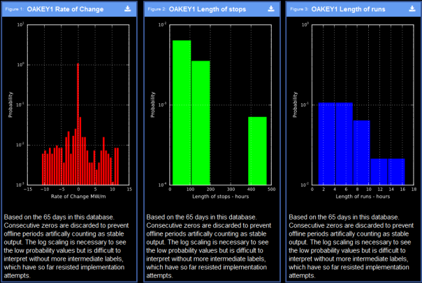
Have found the twin YAxis approach a bit potentially confusing. Can do it but it adds complexity and might lose a few readers. - Length of time not generating v date, AND number of starts v date (both lines on same chart) This can be seen on the 30 day chart. Length of stops and Length of runs histograms might show it well particularly when more days result in more samples.
- Proportion of time v ramp rate. The Rate of Change Histogram might suffice.
- Proportion of time v length of time not generating Is this covered by CapFactor 0% on the Cap Factor Histogram. Also the Length of stops histogram?
These are now available on all units as detailed below.
One day sequences
The One Day Aspect of a unit shows these together with rate of change and prices. This is probably the finest detail required.

30 day sequences
The Last30 days – Rate of Change Aspect shows that series longer than 1 day can be handled, although the X axis labeling needs work. The multi-day series lose the fine detail of the one day series but show the longer pattern of starts and stops better. A year long series might be too compressed to show much. Histograms might be better.

Histograms and scatter plots
The histograms will handle the year series with better precision.


I have increases the marker size since this screen capture.

Peter,
A couple of initial comments:
1. Can you change the background to white? (so I can read them more easily)
2. Can you put up an example with Loy Yang Unit 1 (which was upgraded in Nov/Dec 2003).
LikeLike
More comments on the charts:
1. Overview – add a set of three charts to show: PJB PRIORITY 1 as long a period as possible. Eventually a year.
a. Power (MW, sent out) (all generators)
b. Power (MW, sent out) (Wind) – or selectable
c. CO2-e emissions rate (CO2-e t/MWh sent out) and
d. CO2-e emissions (CO2-e t)?
e. Can you make the x-axis a date range with the range user selectable?
f. Show ‘Power (sent out)’, rather than ‘Power (generated)’ or ‘Demand Power’.
2. I downloaded the csv file from Overview, 3rd chart. ‘Hour of day’ is in decimals. Format it the same as in the AEMO files. Also, it needs a title and explanation to say what’s included and what the units are and the source.
3. ‘CO2Emissions’ – should be ‘CO2-e Emissions’. NGER gives Emissions Factors and Emissions Intensities for CO2, CH4, N2O and CO2-e. CO2-e is the combination of the three. CO2-e is the one used in CO2EII and the one reported. PJB PRIORITY 2
4. Need some instructions on how to make multiple selections and combinations of selections. For example, how can I select:
a. Units Rate of Change & Histogram & SA & Demand
b. Units Rate of Change & Histogram & SA & Wind
c. Units Rate of Change & Histogram & SA & All fuel types (excl. RE)
d. Units Rate of Change & Histogram & SA & Black Coal
e. Histograms & Steam sub critical & black coal
5. Chart titles need to state what the chart plots (e.g. the axes) and the filters applied.
6. Add explanation and definitions of terms on how to use ‘Technical > Custom’.
LikeLike
7. Could you add a page and Excel download which lists the information and data in in the ‘Available Generators CO2EII’ file plus the following for each generator: PJB PRIORITY 2
a. Rated power (MW)
b. Generator type
c. Fuel
d. Company
e. State
f. Location (Lat, Long)
g. Put the COE-e Emissions Intensity in the right most column (note: AEMO uses the wrong term – the figure is the Emissions Intensity, not the Emissions Factor)
LikeLike
Can you make a page where user make the charts described below (and download the data in the Excel file) or can I make these charts from Technical Custom?
1. Up to four or five charts arranged vertically and all with same x axis scale, e.g. date / time
2. The vertical axes on the charts are selected from:
a. Demand (MW)
b. Power (MW sent-out)
c. Capacity Factor
d. Interstate imports and exports (MW)
e. CO2-e EI (t/MWh)
f. CO2-e emissions rate (t/h)
g. CO2-e emissions (t)
3. Each chart can have multiple series such as:
a. State
b. Company
c. Generator class
d. Fuel class
4. The chart title describes the chart, including the axes (e.g. Demand v date) and the filters (e.g. fuel type).
LikeLike